Key Takeaways
- Good Colors for Sleep: The colors in your bedroom can significantly impact your ability to sleep well. Choosing calming and sleep-inducing colors, such as blue, yellow, green, silver, orange, pink, and white, can reduce stress and help soothe the nervous system, contributing to a better night’s sleep.
- Choose Relaxing Colors: Colors like blue and green are associated with calmness and relaxation, while bright and stimulating colors like red or dark shades like black and brown can hinder relaxation and sleep quality. Additionally, using flat paint with a matte finish can create a cozy room by reducing light reflection.
- Factors that Impact Color Effects: When selecting bedroom colors, consider factors like cultural influences, gender, age, and personal preferences, as these variables can impact how individuals perceive and respond to different colors.
The bedroom affects your ability to sleep well. When you feel calm and content, you’re more likely to fall asleep quickly. The colors in your bedroom, in particular, can make the difference between a good night’s sleep or a night spent tossing and turning.
While little research directly explores the impact of color on sleep, the effects of color on mood and emotional state have been studied. Some colors calm us or even make us feel happy, while others can increase feelings of excitement or sadness. Color psychology experts found that some colors put us at ease, while others cause us to feel alert.
Save $450 On Any Mattress

Plus free shipping
In our article, we share the best and worst colors for sleep, so you can better understand how color may indirectly affect the circadian rhythm through their mood-enhancing or dampening properties.
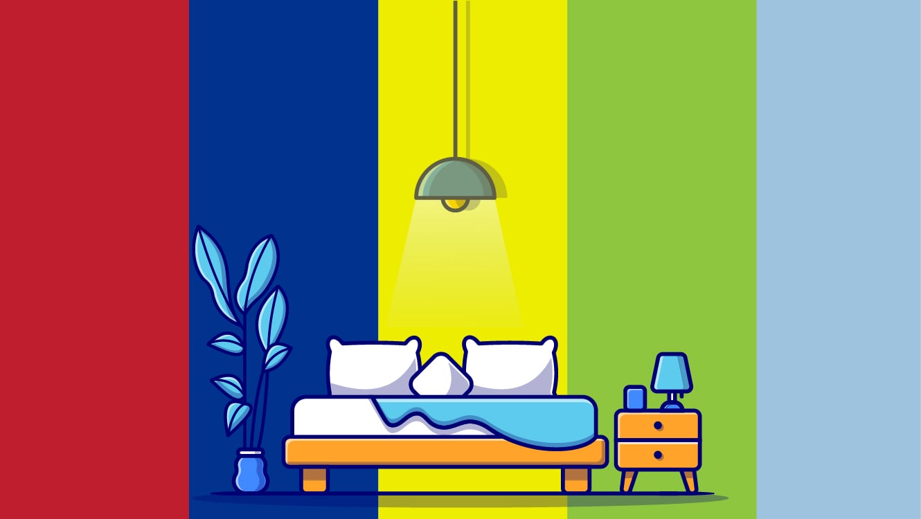
Best Bedroom Colors for Sleep
Good color design can contribute Verified Source National Library of Medicine (NIH) World’s largest medical library, making biomedical data and information more accessible. View source to a more positive mood in and out of the home, and what works for one area of the home may not work for your bedroom.
In our experience, the best colors for sleep are blue, yellow, green, silver, orange, pink, and white. These colors can reduce stress and soothe the nervous system. Try to stick with neutral or pastel shades for a soft, welcoming atmosphere.
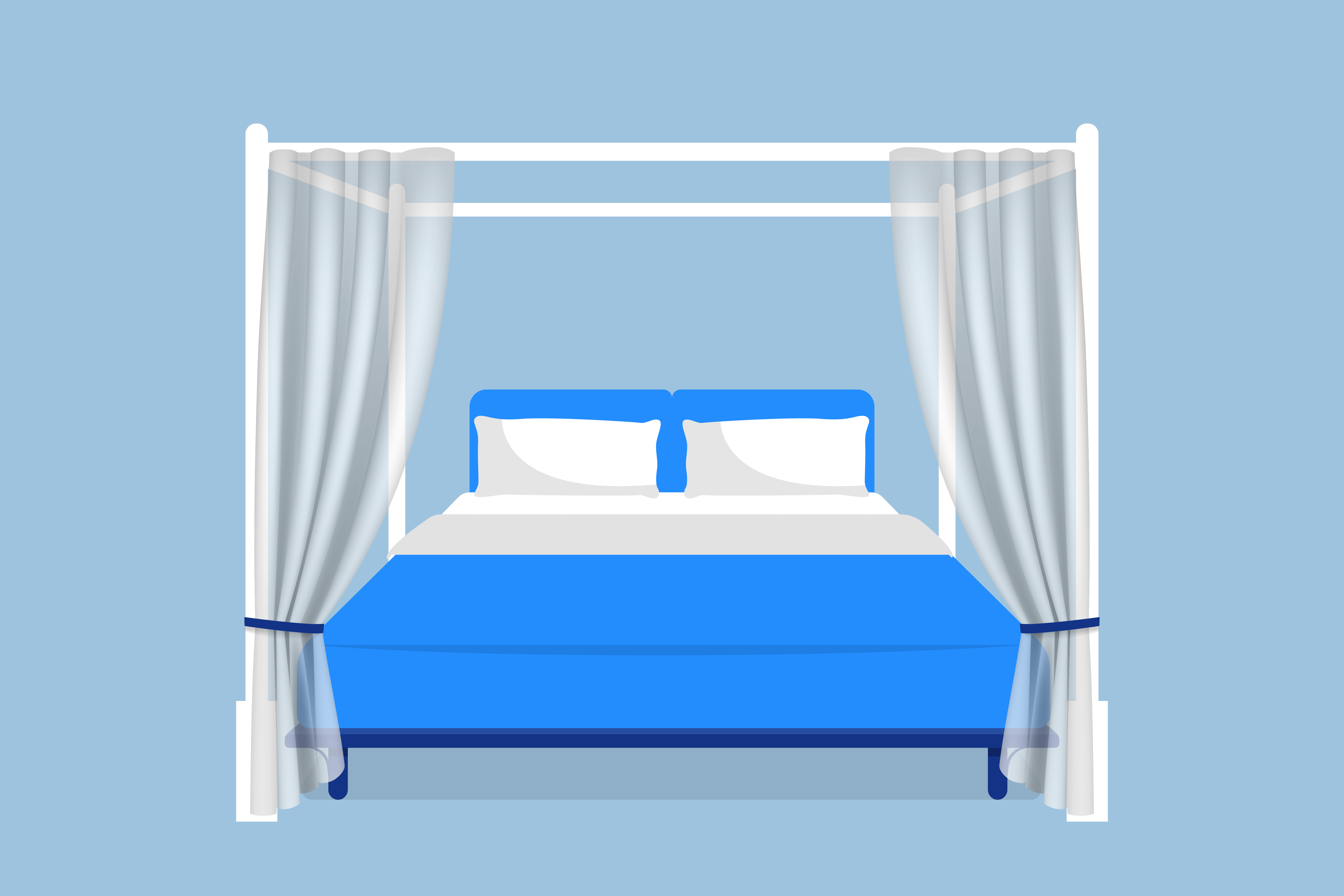
Blue
 One of the best bedroom colors is blue because it’s associated with calm and relaxation. Blue is often considered a non-stimulating color, which can help with sleep quality. And despite the association blue with sorrow, down to phrases like “feeling blue,” a bedroom with a blue color scheme can make you feel calm, content and even happy.
In a 2020 study, Verified Source National Library of Medicine (NIH) World’s largest medical library, making biomedical data and information more accessible. View source researchers explored why certain colors are associated with emotions like happiness and sadness. They discovered that it’s not just about the brightness or intensity of the color but also the specific shade. After considering brightness and intensity, colors with a blue hue were found to be just as happy as colors with a yellow hue, and sometimes even happier.
Worth noting is that blue space Verified Source ScienceDirect One of the largest hubs for research studies and has published over 12 million different trusted resources. View source refers to aquatic areas in urban spaces, such as lakes, rivers, and ponds. The presence of these areas can impact mental health greatly, but not everyone will have easy access. Using blue colors to give your bedroom a pleasant watery cast, along with pictures of therapeutic waterscapes Verified Source National Library of Medicine (NIH) World’s largest medical library, making biomedical data and information more accessible. View source may help you relax at night.
Yellow
 Softer shades of yellow create a tranquil environment because the muted tone imitates sunshine. Soft yellows alleviate stress and promote tranquility, so you can sleep peacefully.
A 2022 study examined Verified Source National Library of Medicine (NIH) World’s largest medical library, making biomedical data and information more accessible. View source yellow’s association with happiness, pairing happy or sad faces with yellow backgrounds, along with blue or gray. Participants were then asked to quickly judge whether the face represented happiness or sadness. The analysis of response time showed that the color yellow facilitated judgments of happiness, while neither blue nor gray facilitated judgments of sadness.
Yellow may also be associated with safety, Verified Source National Library of Medicine (NIH) World’s largest medical library, making biomedical data and information more accessible. View source so it can be a good way to make your sleeping space feel more secure.
Brighter hues can boost energy and should be avoided. Choose pastels that are light and gently creamy, like an ivory color that’s faded to yellow with time. This is especially true if you are designing a bedroom for a child with autism, as their heightened sense can make them more sensitive to bright yellows.
Green
 The color green is another excellent color choice for relaxation. Green is also another easy color for the eyes to see because, like the color blue, they are sensitive to green light.
Similar to a blue room, a green room helps us feel calm and peaceful because green is a non-stimulating color. One example is a 2015 study Verified Source National Library of Medicine (NIH) World’s largest medical library, making biomedical data and information more accessible. View source that examined color preference in subjects with and without schizophrenia found that the participants who did not have schizophrenia preferred green overall, while schizophrenia patients were drawn more to colors associated with depression or anxiety.
The best green colors for sleep should have blue tones—warm tones like yellow may cause you to feel energetic instead of helping you unwind. Remember, pastels are your friend when it comes to promoting sleep, so choose a shade like pastel green. As with blue space, green space Verified Source ScienceDirect One of the largest hubs for research studies and has published over 12 million different trusted resources. View source or greenery in urban areas also impacts mental health. Indoor greenery Verified Source National Library of Medicine (NIH) World’s largest medical library, making biomedical data and information more accessible. View source can also positively impact health, specifically when it comes to feeling more at ease and thinking better.
You may want to bring a little bit of green space into your home by adding some green plants for the bedroom.
Orange / Light Brown
 Light orange colors, including tan and beige, have a warm tone reminiscent of a sandy beach, creating a welcoming space in your bedroom. Choose orange colors with brown undertones, like terracotta, and avoid bright orange colors because they are invigorating to the brain, much like a warm and deep red would be. Remember, softness is key when it comes to picking new hues for your bedroom walls.
Lighter browns with warm-yet-subdued tones may be especially good for a child with autism. A 2016 study Verified Source National Library of Medicine (NIH) World’s largest medical library, making biomedical data and information more accessible. View source found that boys with ASD preferred green and brown, while typically developing boys had brown as their least preferred color.
Pink
 Pink may not seem like a good color for the bedroom because of its red tones. But a soft, natural pink gives off a tranquil feeling that can help you fall asleep quickly.
Avoid bright red tones that can bring the wall forward and make it pop. Pink can be quite eye-catching, as one 2021 study Verified Source National Library of Medicine (NIH) World’s largest medical library, making biomedical data and information more accessible. View source examining people’s reactions to different colors of dental hospital chairs found.
Think instead of cool pinks that help the wall fade into the background of your bedroom. These can still span a wide range, from gentle rosy colors to pale pinks that are almost white.
Pink is also linked Verified Source National Library of Medicine (NIH) World’s largest medical library, making biomedical data and information more accessible. View source to optimistic feelings, at least among women studied in 2016. First, female participants classified words as optimistic or pessimistic while some words were presented in pink and others in black. A control test was also run with black and light blue colors for the same words, to rule out the possible influence of brightness.The results indicated a consistent association between pink and optimism, independent of brightness. Then in another part of the study, female participants exposed to pink showed increased levels of optimism, as opposed to those exposed to yellow instead.
White
 If you already have white bedroom walls, you may not have much reason to change them. It’s a simple, neutral color that is unlikely to create distracting feelings or sensations, though some do find it feels cold and sterile.
White is often considered timeless and classic, Verified Source National Library of Medicine (NIH) World’s largest medical library, making biomedical data and information more accessible. View source so it’s difficult to go wrong with it. A 2015 survey Verified Source ScienceDirect One of the largest hubs for research studies and has published over 12 million different trusted resources. View source asked 80 participants to choose their most preferred color for a living room, along with preferred clothing color. And white was the clear favorite for living spaces, at 33 percent.
If you find white walls boring, you might want to try an accent wall with some of our other color recommendations. White goes well with everything, after all.
Bedding that offers muted pastels, neutral tones, and other relaxing colors can keep a white bedroom from feeling uninviting. Though the drawback is that eventually these sheets will lose their luster and you will need to take steps to whiten your sheets.
You can also make the room feel warmer by going with a slightly off-white color, such as ivory or cream tones that can look almost like very pale yellows.
Silver
 Silver is a great choice if you prefer neutral colors. Unlike dark gray tones, silver induces calm feelings instead of depressive ones. Be sure to choose a matte silver color and not a shiny paint—the shine reflects any bright light, keeping you awake.
Essentially, it should be a soothing shade of light gray. If you find light gray or silver is bland on its own, you may want to pair it with a gentle blue accent wall.
Worst Bedroom Colors for Sleep
In our experience, bright purple, gray, brown, black, and red are the worst colors for sleep. Individals often associate gray, brown, and black with negative emotions, while purple and red can feel too active for a restful space.
While you can repaint your bedroom walls if you choose a color that simply doesn’t work for you, it’s best to save yourself the hassle of extra work by understanding what hues are linked to stimulating or uncertain feelings.
Bright Purple
 Bright purple is not a good choice for the bedroom. Bright purple hues have reddish undertones, increasing energy levels and keeping you alert, but softer purple shades may boost sleepiness, as some find the
color soothing.
Verified Source
National Library of Medicine (NIH)
World’s largest medical library, making biomedical data and information more accessible.
View source
Bright purple is not a good choice for the bedroom. Bright purple hues have reddish undertones, increasing energy levels and keeping you alert, but softer purple shades may boost sleepiness, as some find the
color soothing.
Verified Source
National Library of Medicine (NIH)
World’s largest medical library, making biomedical data and information more accessible.
View source
If you’re set on painting your bedroom purple, try to choose a more muted tone, like lavender, because of its cool undertones. Remember, the goal is to have your bedroom walls almost fade into the background of your mind, not immediately jump out at you every time you look at your wall.
Dark Gray
 Dark gray is linked to depression in color theory because it gives a similar feel to a rainy or overcast day. Dark gray is a good accent color, like a trim along the floor molding and door frame to offset a lighter neutral color. However, painting the entire walls this dark shade and adding gray bedding creates a somber atmosphere, which some may find hampers their relaxation.
Silver or gray with blue undertones are better choices if you want a neutral color. As mentioned above, a hint of dark gray is fine for floor trim and such to offset lighter gray shades.
Now, while conventional thought is that seeing grey can boost depression, it may actually be the other way around–in other words, you’re more likely to see grey if you’re depressed.
One 2010 study Verified Source National Library of Medicine (NIH) World’s largest medical library, making biomedical data and information more accessible. View source looked at how depression might affect our vision. They measured the pattern electroretinogram (PERG) in people with depression and in healthy individuals to see if there were any differences. They found that depressed patients, whether they were taking medication or not, had lower retinal contrast gain compared to healthy subjects. This difference in contrast gain was strongly linked to the severity of depression.
An older 2002 study Verified Source National Library of Medicine (NIH) World’s largest medical library, making biomedical data and information more accessible. View source explored the connection between mood disorders and color sensitivity by surveying 120 participants. They found that those who reported feeling depressed also mentioned a change in color perception, with things appearing gray or lacking color. These findings suggest that color sensitivity may be impaired during depression, though the study also concluded further research was needed.
Brown
 Brown is a gloomy color, as one
2018 study noted.
Verified Source
National Library of Medicine (NIH)
World’s largest medical library, making biomedical data and information more accessible.
View source
The shade can increase subconscious feelings of sadness and cause restlessness instead of sleep—not exactly a cozy feel for the bedroom atmosphere.
Brown is a gloomy color, as one
2018 study noted.
Verified Source
National Library of Medicine (NIH)
World’s largest medical library, making biomedical data and information more accessible.
View source
The shade can increase subconscious feelings of sadness and cause restlessness instead of sleep—not exactly a cozy feel for the bedroom atmosphere.
Warmer browns with orangish tones can feel calming and soothing, but darker, cooler browns may make it hard to relax.
Red
 Red is an invigorating color, increasing heart rate. One study found the color
red increases brain activity
Verified Source
National Library of Medicine (NIH)
World’s largest medical library, making biomedical data and information more accessible.
View source
and boosts alertness, something you don’t want when trying to relax and fall asleep. For many, red is a color
linked to a perceived threat.
Verified Source
National Library of Medicine (NIH)
World’s largest medical library, making biomedical data and information more accessible.
View source
Red is an invigorating color, increasing heart rate. One study found the color
red increases brain activity
Verified Source
National Library of Medicine (NIH)
World’s largest medical library, making biomedical data and information more accessible.
View source
and boosts alertness, something you don’t want when trying to relax and fall asleep. For many, red is a color
linked to a perceived threat.
Verified Source
National Library of Medicine (NIH)
World’s largest medical library, making biomedical data and information more accessible.
View source
Aside from its stimulating effects, red sheets and blankets can also make your bed more appealing to a certain pest. An Oxford study Verified Source Oxford Academic Research journal published by Oxford University. View source found that red, along with dark colors, draw in bed bugs.
If you love the color, we recommend pastels that are closer to pink in hue. You can also have an accent wall with soothing white walls, to minimize distraction and stimulation. For romantic bedroom colors to appeal to your partner, consider gentle creams and light lavenders along with pastel pink, instead of bright, throbbing red shades. While red is associated with romance Verified Source National Library of Medicine (NIH) World’s largest medical library, making biomedical data and information more accessible. View source , it’s far from your only option.
Black
 Black bedroom walls may sound like a soothing way to improve sleep, promoting a dark sleeping space. In practice, however, black bedroom walls can feel depressive and create feelings of gloom and sadness. Similar to how dark brown shades are linked to negative emotions,
black is often linked
Verified Source
National Library of Medicine (NIH)
World’s largest medical library, making biomedical data and information more accessible.
View source
to sadness, fear, and anger.
Black bedroom walls may sound like a soothing way to improve sleep, promoting a dark sleeping space. In practice, however, black bedroom walls can feel depressive and create feelings of gloom and sadness. Similar to how dark brown shades are linked to negative emotions,
black is often linked
Verified Source
National Library of Medicine (NIH)
World’s largest medical library, making biomedical data and information more accessible.
View source
to sadness, fear, and anger.
If you enjoy the color, black curtains can add a touch of pop against a lighter neutral color and promote darkness for better sleep. You may also want to consider a half-wall design with black and another color.
As with red, black sheets and such can attract bed bugs.
Painting Tips
Before painting the bedroom walls, we recommend establishing a color scheme with sleep-promoting colors and using flat paint to create a cozy environment conducive to sleep.
Color Scheme
 Decide on a color scheme for your bedroom makeover before painting to avoid color clashing. Choose colors parallel to each other on the color wheel—contrasting colors are stimulating, because they clash with each other, so instead of a sleep-inducing environment, you may feel anxious and restless. This is especially true if you have three walls that are one color, usually white, and an accent wall.
While we discussed accent walls with a primarily white bedroom, it’s important to remember these should be largely soothing, light colors such as pastels. An accent wall that’s making a statement and providing a bright flash of color should be saved for other rooms in the home, like the kitchen or living room.
Before you start painting, you may want to have a clear idea of what color your bedding will be in your room. While sheets, blankets, duvet covers, pillowcases and pillow shams are all easy to switch out, it’s still helpful to have the right bedding at the start instead of replacing it with more neutral-colored bedding.
Flat Paint
Stick with flat paint, instead of one with a high-shine or glossy finish. The shine reflects light, disrupting sleep. Flatter paints with a matte finish absorb light and are less invigorating, promoting relaxation.
Hue, Saturation, & Brightness
When it comes to how your bedroom colors will look, hue, saturation, and brightness are important color characteristics that play a significant role in determining the overall aesthetic and atmosphere of a space. These three characteristics Verified Source National Library of Medicine (NIH) World’s largest medical library, making biomedical data and information more accessible. View source are a key part of establishing how your chosen colors will affect you and your emotions Verified Source National Library of Medicine (NIH) World’s largest medical library, making biomedical data and information more accessible. View source
Hue
Hue refers to the attribute of a color that distinguishes it from others on the color wheel. It represents the basic color category or the dominant wavelength of light that gives the color its name, such as red, blue, green, etc. In other words, hue is what allows us to differentiate between various colors of the rainbow.
Saturation
Saturation, also known as chroma or intensity, refers to the purity or vividness of a color. A color with high saturation appears vibrant and intense, while a color with low saturation appears more muted and pastel-like.
Manipulating saturation allows designers to create different levels of visual impact and mood within a room. Using highly saturated colors can add energy and boldness to a space, while desaturated or less intense colors can contribute to a more subdued and relaxed atmosphere.
Brightness
Brightness, also known as value or lightness, relates to the amount of light reflected by a color. It determines how light or dark a color appears. Colors with high brightness are lighter and closer to white, while colors with low brightness are darker and closer to black.
Color brightness affects how we perceive depth Verified Source National Library of Medicine (NIH) World’s largest medical library, making biomedical data and information more accessible. View source so brightness can be a crucial component of making a small bedroom feel bigger. Verified Source National Library of Medicine (NIH) World’s largest medical library, making biomedical data and information more accessible. View source For example, a 2018 study Verified Source National Library of Medicine (NIH) World’s largest medical library, making biomedical data and information more accessible. View source found that a bright ceiling color made it appear taller.
Culture and Color Associations
Much of the research done with color psychology does look at the idea with Western researchers and participants. However, we must note that color associations can vary by culture, which can mean that how a person reacts to color depends on the culture they were raised in.
One 2020 study Verified Source National Library of Medicine (NIH) World’s largest medical library, making biomedical data and information more accessible. View source looked at how people from different cultures associate meanings with colors. They tested various colors and found that some associations seemed universal across cultures, like white symbolizing purity and blue representing water and the sky. However, there were also some differences between cultures.
For example, the study observed color red is associated with enthusiasm in Chinese culture but with attraction in English-speaking culture. A 2014 study Verified Source National Library of Medicine (NIH) World’s largest medical library, making biomedical data and information more accessible. View source similarly found that color-odor associations are influenced by cultural experiences, with some cultural groups having more similar patterns of associations than others.
Another 2020 study Verified Source National Library of Medicine (NIH) World’s largest medical library, making biomedical data and information more accessible. View source investigated whether color-emotion associations are universal or influenced by culture and language. They tested emotional associations of colors in over 4,500 participants from 30 countries who spoke 22 different native languages. The results showed that there were universal color-emotion associations across all participants, but there were also some local differences. A nation’s culture and language influenced these associations, and similarity was greater among nations that were linguistically or geographically closer.These findings can help researchers better understand how color influences our thoughts and behavior in both universal and culturally specific ways.
Gender and Color Preference
Along with culture, your biological sex may also affect how you respond to different shades and hues. One 2015 study Verified Source National Library of Medicine (NIH) World’s largest medical library, making biomedical data and information more accessible. View source investigated how color preferences vary not only between different cultures but genders, too. They compared English and Arabic participants and found that their color preferences differed, with Arabic participants showing stronger preferences overall. There were also differences between males and females within each culture.
For example, in the English group, males tended to prefer colors in the blue-green region, while females preferred colors between purple and blue-green. In the Arabic group, males had similar preferences to English males, but females had a strong preference for reddish colors.
A later 2018 study Verified Source Wiley Multinational publishing company specializing in academic and instructional materials. View source found that both Indian men and women generally preferred cool colors over warm colors. This preference for cool colors was consistent with similar preferences observed in US participants.
However, there were some cultural differences in color preferences, especially among women. Indian women showed a preference for pink colors, similar to what was observed in British, Chinese, and Arabic women. But, unlike other cultures, Indian women’s preference didn’t extend to purple and lavender.
The study also ruled out personality traits or gender schemas as universal explanations for gender differences in color preference. While it seems there are some common color preferences across cultures, the results suggests there are also unique cultural influences on color preference, particularly for women.
An older 2010 study Verified Source National Library of Medicine (NIH) World’s largest medical library, making biomedical data and information more accessible. View source also suggests that women may perceive more colors than men do. They tested 60 healthy people, half male and half female, between the ages of 17 and 22. The participants were asked to match different colors with sample color strips. The results showed that overall, females had more correct answers and were faster at the task compared to males.
So if you share a bedroom with an opposite-sex partner, don’t forget to work together when devising a bedroom color scheme, along with getting one of the best mattresses for couples.
Age and Color Perception
Much research has been done on how our ability to see colors decreases with age, with concerns about this dating back to 1942. “While few people younger than 70 have problems with color vision, the rate increases rapidly through later decades of life, with the majority of problems encountered with the blue-yellow colors,” a 2014 study notes.
This decline in color vision may account for the way that older adults’ color preferences seem different from younger individuals. For example, a 2001 study Verified Source National Library of Medicine (NIH) World’s largest medical library, making biomedical data and information more accessible. View source investigated whether color preferences undergo further changes during adult life, focusing on younger and older native Germans aged 19 to 90 years, totaling 842 adults in Mainz, Germany.
Participants were asked to select their most and least preferred colors out of four given options: blue, green, red, and yellow. The frequency distributions of color preferences for both age groups and sexes were analyzed, and all significantly deviated from chance, indicating strong color preferences among the participants.
The findings revealed that blue was the most preferred color for both age groups and sexes, while yellow was the least preferred color. Green and red were in the middle position of the rank order of color preferences. Men and women did not show significant variations in the ranking of their most preferred colors. However, when it came to ranking their least preferred colors, men more often chose yellow and less often selected red compared to women.
The most significant changes were observed in the color preferences with advancing age. As individuals aged, the preference for blue decreased steadily, while the popularity of green and red increased significantly. The study proposed several factors for this, such as changes in color discrimination and visual imagery, yellowing of the crystalline lens, and decreased function of the blue cone mechanism associated with aging.
Similarly, a 2022 study Verified Source National Library of Medicine (NIH) World’s largest medical library, making biomedical data and information more accessible. View source investigated the association between color psychology and community health environment design. The findings showed that yellow was the most preferred hue, with different age groups showing varying color preferences. Warm, bright, and soothing colors were preferred when feeling anxious, lonely, or emotionally unstable.
The results showed that the elderly (aged 75 and up) tended to prefer brighter colors such as red, orange, yellow, and green. Specifically, yellow was the most preferred color by the elderly, with green and blue following as the second and third choices, respectively. They showed a particular inclination towards warm and vibrant colors, colors that are lively, bright, and cheerful. In contrast, they did not favor dark or dark colors such as black and white.
When it came to lightness selections, the elderly tended to choose medium lightness more frequently than high or low lightness. This indicates their preference for colors that are not too intense or too light, but rather somewhere in the middle. They sought a similar balance in color purity selections, preferring colors that are not too saturated or too dull.
This is an important point for older adults and any potential caregivers to keep in mind as they look to pair the right bedroom colors with a mattress for seniors, along with other measures for bedroom safety such as guardrails on a bed frame to minimize the possibility of falls.
Other Ways to Create a Relaxing Bedroom
 If you want to improve your sleep hygiene with the right bedroom set-up, there are a few simple tricks you can consider beyond the colors you paint your bedroom walls.
Darkness in the bedroom is essential. If light tends to slip through your bedroom window at night, you might want to consider blackout curtains that will create an atmosphere that promotes sleep.
It’s also helpful to get as much technology out of the bedroom as possible. Ideally, you should have only your alarm clock and perhaps your cell phone, which should be switched off at night if possible. We suggest keeping TVs, tablets and computers out of the bedroom, as they can feel distracting even if they are switched off.
If you can, try to use your bedroom during the day as little as possible. For example, if you work from home, resist the temptation of working on a laptop in bed. Instead, try to save your bedroom for sleep and sleep alone.
Re-doing your sleeping space for increased comfort doesn’t have to break the bank, as there are plenty of budget-friendly hacks and DIY tricks to makeover your bedroom, as Redfin discusses. You can even get creative with stencils and create a design that mimics wallpaper without the cost and bring in distinct textures with different fabrics and materials.
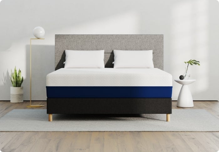
Typically, the most expensive part of any comfortable bedroom is the mattress. However, you can squeeze the highest value from your bed by equipping it with one of the most durable mattresses on the market.
We have other guides that suggest ways to create the best bedroom setup for sleep:
- How a Tech-Free Bedroom Creates Smarter Sleep
- Creating a Calm, Clutter-Free Bedroom
- How to Cool Down a Room
- How to Block Out Noise While Sleeping
- Sleeping With A Fan On
- Fire Safety Tips for the Bedroom
- Bedrooms for Asthma
- How to Arrange Accent Pillows on the Bed
- How to Make a Small Bedroom Look Bigger
FAQs
What color light helps you sleep?
Warm light is better for sleep because the eyes are less sensitive to the longer wavelengths in warm light. Light bulbs with a yellow or red hue and are best for bedside lamps. Blue light, on the other hand, is the worst for sleep. Blue light from LED light bulbs and electronic devices disrupts melatonin production because your eyes are more sensitive to blue light.
Are white sheets a good color for sleep?
White bedding is an excellent choice for sleep because the neutral tone doesn’t stimulate the brain, unlike bright red and purple tones. White is neutral and has a relaxing effect, pairing well with other colors conducive to sleep, including blues and yellows.
What colors make a room look bigger?
Soft shades and natural colors can make a small bedroom appear bigger and more open—you may want to consider light blues, pale greens, and off-white colors for smaller spaces, like a studio or one-bedroom apartments where space is limited.
Another technique is painting the molding a lighter color than the walls, giving the illusion of a larger space in a small studio apartment bedroom.
Strategically hanging a wall mirror can also give the impression of a larger room. Depending on the mirror’s angle, it can increase the amount of sunlight in the bedroom by reflecting what light comes in the window. This is a simple yet effective way to update your bedroom for summer.
What are good neutral tones for the bedroom?
If you can’t sleep, don’t force yourself to stay in bed—this increases stress and makes it harder to fall asleep. Instead, get up, leave the room, and do a simple activity, like writing in your journal or reading a book. When you start to feel sleepy, go back to bed.
What color helps with anxiety?
Researchers have found the color blue induces feelings of tranquility and peacefulness, the opposite of anxiety. A blue room doesn’t alert the mind, and instead, promotes calm, so you feel more at ease—you’re likely to fall asleep and stay asleep than you would if sleeping in a brightly-painted bedroom.
Conclusion
Some of the best colors for sleep have a soft, natural hue to create a calm atmosphere, perfect for deep sleep. Choose colors appealing to your taste and create a color scheme to enhance sleep. Light blue is one of the best colors for sleep because the soft tone creates a calm and inviting atmosphere conducive for sleep.
About the author
Geoff McKinnen is a writer focusing mainly on the healthcare industry and has written articles on everything from foods to help you lose weight to the connection between Alzheimer’s and sleep. Geoff’s passionate about helping readers improve their well-being to lead happier lives. Outside of work, Geoff enjoys cycling and hiking and believes that by leading a healthy lifestyle, he can help others do the same.
View all posts